|
|||
|
|
|||
![]()
![]()
![]()

|
| |
What's With the "Special" Color in Wild Flowers?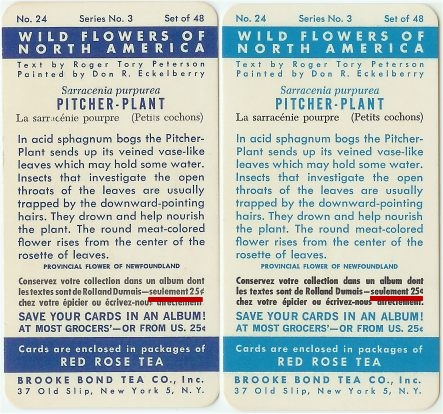 There was a "special" variation that came out
in the Wild Flowers series for the US. The cards are rather hard to
come by. Most of the difference has to do with the color. It's still
blue, but a different shade. Some people call the color teal while I
have also heard turquoise. Both shades refer to a bluish-green. Another
funny thing about this off-shade is that it looks pretty much like the
standard blue if you look at it in fluorescent light. Looking at
the two here, the standard one is on the left while the "teal" one
appears on the right. There was a "special" variation that came out
in the Wild Flowers series for the US. The cards are rather hard to
come by. Most of the difference has to do with the color. It's still
blue, but a different shade. Some people call the color teal while I
have also heard turquoise. Both shades refer to a bluish-green. Another
funny thing about this off-shade is that it looks pretty much like the
standard blue if you look at it in fluorescent light. Looking at
the two here, the standard one is on the left while the "teal" one
appears on the right. Why did they print these special cards? There's a question a few people would like to know. Maybe they ran out of the standard blue ink. Maybe they were experimenting. We don't even know if these cards were made at the first of the run, the middle or as a finale for the series. Wow, they look pretty darn similar, don't they. The sharp eye of an avid collector has found another difference. Once again, many thanks to Terry Calleyne of Ireland for pointing out that there is a definitive way to determine the special cards.
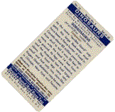
Hunting Tip: Take note of where I have underlined in
red in the picture above. That
is the only place to look. Don't be tempted to look at the other
twenty-five cent symbol. Your mission, should you decide to accept it,
is to find a Last modified: February 18, 2017 |
|
Send mail to with questions or comments about this web site. |
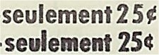 There are two places where the card mentions
the cost of an album. If you look at the French text, you will see that
the bar in the cent symbol is at an angle while (whilst for the
British in the crowd) the special one has a vertical bar. So in the
picture here, the top one is more common while the bottom one is rare.
Thanks Terry! Now even the color-blind can hunt for the rarer
version! OK, now that you know, go out and scour your cards.
Don't forget, I am looking for them for my personal collection and am
willing to pay.
There are two places where the card mentions
the cost of an album. If you look at the French text, you will see that
the bar in the cent symbol is at an angle while (whilst for the
British in the crowd) the special one has a vertical bar. So in the
picture here, the top one is more common while the bottom one is rare.
Thanks Terry! Now even the color-blind can hunt for the rarer
version! OK, now that you know, go out and scour your cards.
Don't forget, I am looking for them for my personal collection and am
willing to pay.